Redefining Access Management

My Role
I led a Product Designer and Visual Designer from my team of 5 direct reports to form a project team. I was responsible for planning, requirements gathering, strategy, wireframing, research, customer interviews, and executive presentations. My team also partnered with the UX research team, and Product Managers for research, scope, and roadmap planning. I also partnered with Engineering leads to plan project feasibility, and resource assignments.
I was primarily involved during the discovery and definition phase, and acted in a supportive role as the team carried the project into the development phase.
The landscape is shifting beneath our feet
As businesses move to the cloud, we’ve had to re-evaluate our place in the market.
Old dog, new tricks
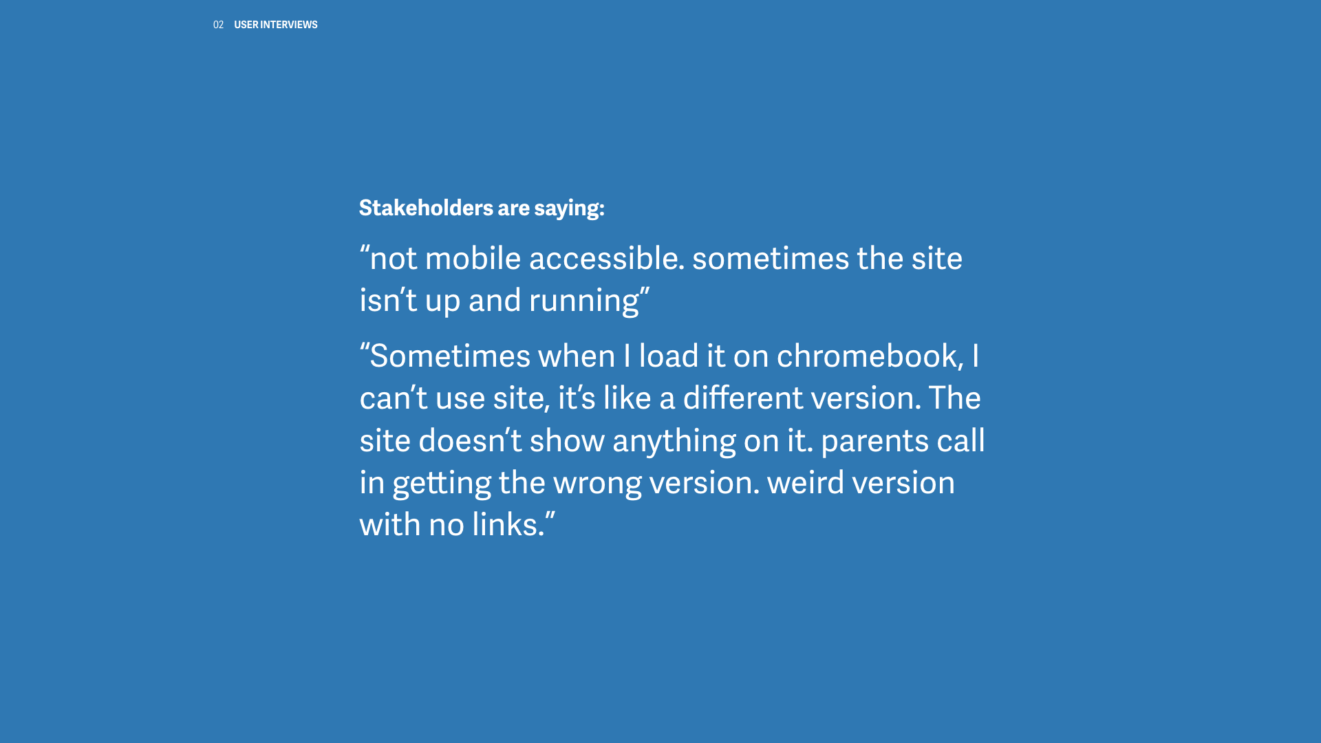
The observability landscape is shifting as many customers are increasingly adopting new technologies, and transforming their businesses in the cloud. The legacy Commercial SaaS AppDynamics product was built on a monolithic infrastructure with outdated technologies. It has trouble scaling to meet customer needs, and forces users to map their companies onto a rigid App/Tier/Node model that does not necessarily fit their mental model.
As a result our access management and permissions structure is limited, does not scale to users needs, and in some cases exposes security risks.
The scope of this project was to completely redesign the access management experience.

Persona
Allison the AppDynamics Admin
Allison has been at her company for many years, maintaining and administering IT tools. She got started as a developer, but that was ages ago and now she is used to the many administration panels provided by off-the-shelf commercial software. Even so, her team has to administer many IT apps and they are constantly inundated with requests. She and her teammates know there must be a better way to manage enterprise tooling at scale.
Allison; an Admin’s life isn’t easy
At the start of this project we had a role based access control model. Each role contains a different set of preset permissions. Every time a user onboards a new application to monitor, they have to create and assign permissions and access. They have to do this in each hosting environment, that we call “controllers”. Companies have multiple controllers. Editing these permissions is time consuming, and confusing. Often a permission is presented with an obscure title and a checkbox. Once created there’s no ability to copy and paste across controller environments.
We’ve heard from numerous customers that they are required to generate up to three roles (View, Application Admin, and Super Admin) for every application that is being monitored by AppDynamics. When a customer has 1000+ applications, the amount of time spent in the UI clicking and creating roles can become tedious – and in some instances requires a dedicated team to do just that.
In other cases multiple roles are required to complete the workflow successfully. By requiring multiple roles, we’ve created a challenge for Admins who have to retain this knowledge or manage access by trial-and-error.
It’s a shell game of permissions

Yes, that’s tabs, checkboxes, and hidden menus. In addition to the 12 default roles, with no context as to what these permissions are effecting.
16 steps minimum!

That’s at least 16 steps through multiple menus to create a custom role. Hopefully without exposing access to the wrong thing.
People HATE this
Permissions are overused across the product and lead to confusion, security issues, and escalation tickets.
Major security Risks
There is no breakdown across servers. Users can either have access to ALL servers or NO servers. This has caused some customers to limit the number of servers monitored by AppDynamics or reduced the number of users that have access. Thus reducing the value of AppDynamics.
When granting access to the dashboard edit permission, the end-user also has the ability to share the dashboard. This is a security risk because once shared, it can be accessed with no authentication and no oversight as to who can view it.
Users that only need to view Agents are required to have the "Admin, Agents, Getting Started Wizard" role. Once enabled, the user will have full admin access across the controller.
The Pain is real
“I wouldn't want someone getting access to 20 different things, I’d want to assign those 20 things individually. I wouldn't want to make it a one size fits all. We operate on a least privileged basis. It can be restrictive, but in today's environment you need to be.”
"I can create a role, but I cannot create any permissions. If we could create permissions and roles from the Rest API, we could probably automate this. Then we wouldn’t have to sit in here and click around."
"There might be a ton of rules behind a role that you assign, so you don’t know exactly what you’ve given out. Making it really clear [in documentation] without having to read war and peace to understand. A good GUI is always helpful.”
Goals
Improve Security; Allow Admins to grant access only as it’s needed
Improve Usability; Reduce error by making permissions clear and granular
Improve Utility; Provide the ability to apply permissions from one environment to another
A standard approach
After hearing from users, I wanted to leverage industry standards and common patterns for managing access control.
Admins use many IT apps in addition to AppDynamics. I wanted to see how competitors and contemporaries were defining access management. During interviews, AWS came up a few times, and I had an engineer walk me and my team through how they set permissions using policies in the AWS interface.
I was compelled – I did a deep dive into the AWS documentation to better understand how AWS approached policies. In addition, I also did a comparative analysis of Google Cloud, Salesforce, Okta and Jira.
I drafted some diagrams to explore a policy model that would allow users to create access permissions at the entity level.


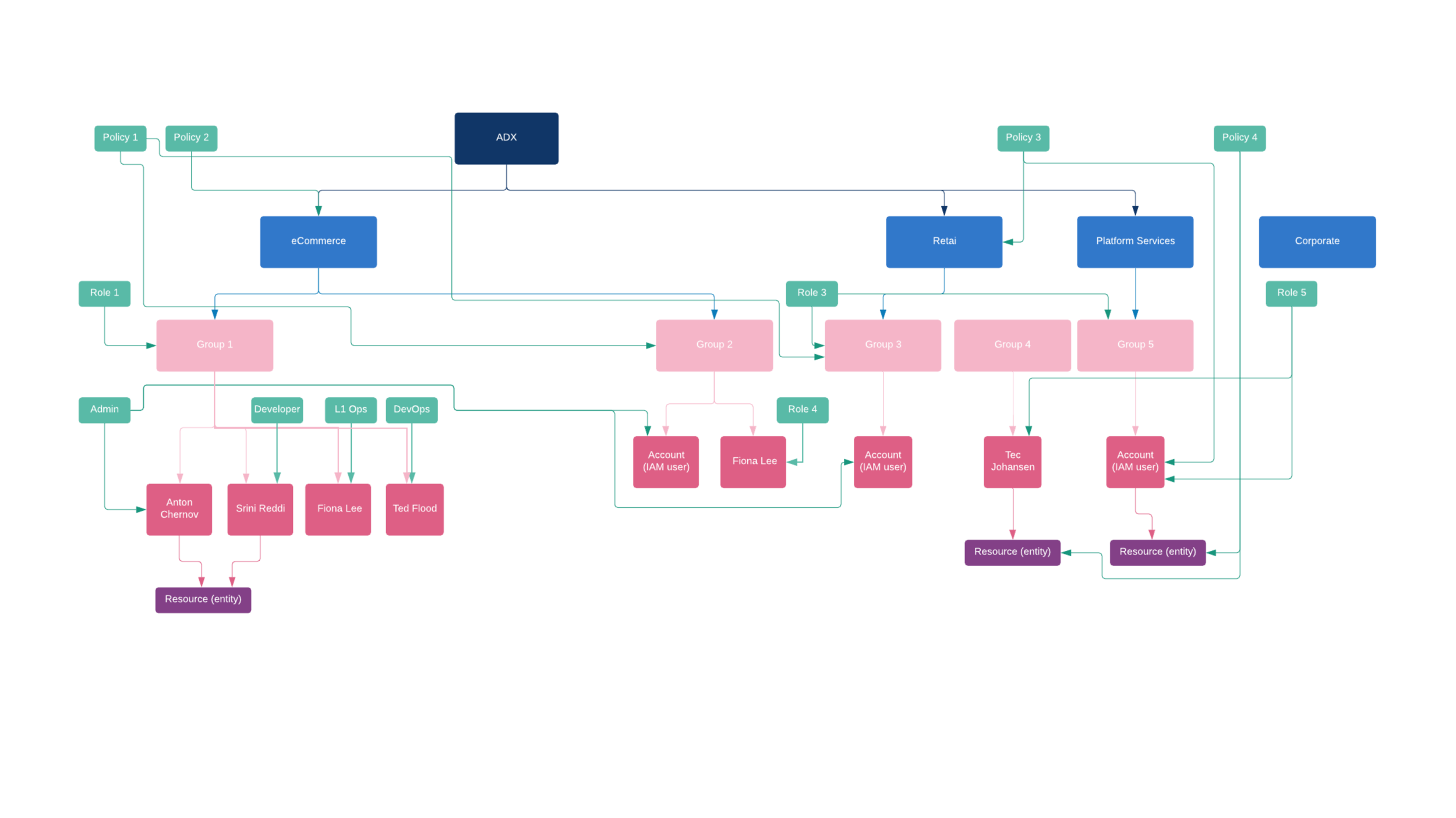
ADX is a fictional company we created to experiment with how the policies might map to an organization.
Assumptions
By leveraging the concept of policies, Admins can manage access for roles, groups, users, and any entity or resource. This would mean any time an administrator onboards a new application, creates a dashboard, or adds a user into the system, they can simply apply an existing policy allowing or denying access, and further refine access from there. This model of access would go beyond confusing role based access control, and allow users to assign permissions more intuitively.
More interviews, more to learn
I needed feedback, so I ran this by a Product Manager I partnered with. He had done some independent discovery research which informed our hypothesis. I wanted to learn more so I did a round of internal interviews during which I talked to Engineers, PMs, Sales Engineers, and Customer Representatives.
Based on what I was hearing I developed a series of user flows and wireframes to help me understand and communicate how these entities mapped.

Task flow
These are some of the basic tasks an administrator might need to accomplish. I initially started from the new user onboarding perspective to find opportunities to improve the experience from the first touch point with Admins. I drafted this after talking with PMs and Customer Sales Representatives to understand where in the flow Admins might need to set permissions.
Motivational insight
Once an application is onboarded, the Admin needs to add people to view it. In the previous model it was done with obscure default roles. I wanted to explore a more flexible model. The concept of groups, copy, and adding permissions to an entity were all things that could not be done in the old system.
I needed to go deeper
After sharing the previous flows with a PM and an Engineer, I got a better understanding of the application onboarding process. I built on the previous flow by exploring the add user, business unit, groups, and roles onboarding flow. This is also where I started looking at access through an API, and adding users through and Identity provider.
Team, assemble!
Once I had the initial round of flows, I pulled in one of the product designers on my team. We started whiteboarding, then moved onto to wireframing, and after we settled on a strategy she led the design, developed the next round of user flows, and built a prototype to demonstrate the future vision of access management.

How might we create policies beyond the application?
We started sketching on the whiteboard to explore how we might create access policies at the entity level. We wanted to look at creating policies beyond the application; what would it look like for organizations, groups, users, dashboards, and pages?
We started at zero
Once we started wireframing, we wanted to explore the first time user experience. We asked ourselves, how did access management look the first time an Admin logs into the system?

An Admin homepage
As part of the first time user onboarding experience, we explored the concept of optimizing the homepage for Admins. I talked to the PM I had partnered with, and some Customer Sales Reps to generate a list of activities Admins would typically be doing on set up. The focus was around adding users, and delegating tasks. We featured permissions prominently because my assumption was that Admins would want access defined before adding people.
We eventually moved away from the idea of having this on the homepage to favor a focus on configuration. This concept evolved into Admin tools, and eventually the Accounts overview page.


We’re gonna need a bigger boat
With the prototype ready, I developed a narrative, and presented it to executive leadership to get buy-in to move forward with additional resources.
The leadership team, including myself took this prototype on a round of customer visits throughout the UK. During these customer visits I presented the prototype as part of larger showcase to explore the future vision of AppDynamics.
We were ready to start cooking
It was time to start developing the vision into a reality. We pulled in engineering resources while the Product Manager began narrowing scope and defining engineering requirements. My team revised the mockups and generated another round of wireframes to account for the narrowed scope.
Another round, another research
With a revised wireframe prototype in hand, the Design team and lead Product Manager partnered with the User Research team and conducted 3 studies with 6 participants.
This included an observational inquiry in which we asked administrators to show us how they managed users and access; this provided insight into the workflows Admins are familiar with.
We conducted a card sorting exercise to identify trends, terminology and behaviors. We also conducted a task based usability study with the prototype.
We learned a little more
The team explored an option with a step wizard, but it didn’t solve the problem of options being hidden within the interface. This actually confused users, but It did help push the terminology discussion forward. The summary section got a much better response. Users liked seeing all the selections they made, they felt that it was much clearer.

Admins want simplicity
“As a sysadmin I go into these tools to do config, and there are definitely systems I feel lost. There are menu options on the left, on the top [...]. I don’t like diving through all these menus to do simple stuff. I’d rather have one simple menu that stays the same and use it that… ”
“We like products that integrate with AD. Instead of being able to import and delete users in one place we had to go through a checklist of things in each application. If this guy gets fired we have to go through a long checklist of actions in different places just to delete them.”
“The more granular the better, everything is least privilege model so you can slowly start adding things they need”
From research to insights
We heard from 4/6 participants that they prefer the “least privileged model”, which validated our assumptions that users needed more granular control and would benefit from our policy model.
This led the team to further explore the least access privilege model, and build the policies on top of that.
The principle of least privilege is an information security concept in which a user is given the minimum levels of access or permissions needed to perform their job functions.

Bringing it all together
As we continue to build the tech stack that will support the future version of the policy experience, the team developed a version that builds on only 3 types of roles; the 3 roles we heard users tell us they used the most. We added a summary section so it’s clear exactly how much access is being granted. We revised the terminology and labels based on what we learned during research and testing sessions. And we brought it all into a single interface.

Where do we go from here?
The team then developed an execution plan. This included refining permission in the legacy controller to support an API, and the least privileged access model. Then breaking down the scope for entity mapping with policies and iteratively redesigning the access management experience within the next generation product experience, built on an entirely new tech stack capable of supporting the entity mapping model.
Some takeaways
We set out to give Administrators more control over how they defined access for their resources. After hearing how users think about setting access control, we settled on the least privileged access model. This model meant that no user would get unnecessary access if it isn’t required for the workflow. This improved security by ensuring users wouldn’t get access where they didn’t need it while providing clarity into how access is granted. By building a foundation for access policies Admins can grant or deny access globally, defining permissions at the entity level. An improvement over the obscure roles.
Testing my assumptions
My assumptions were that people would universally understand policies in the permissions context. After testing we learned that the terminology overall was pretty confusing. We also used policies to define health rules, so it was important to clarify these as access policies.
We also heard that people really wanted an API first, this is something I touched on within with design, but didn’t spend enough time exploring the API first solution. It became an area of focus as the Product Manager began defining scope and requirements.
A point of pride
The designer on my team wanted to build leadership and presentation skills. I encouraged her to share work during design reviews. To prepare, I coached her through presentations and practice runs. During customer visits we had the opportunity for her to present the prototype and collect feedback. She continued to lead the User Management experiences within the Accounts team. This growth contributed to her receiving a promotion from an Associate Designer to Lead Designer.
Simplified Agent Install

My Role
I led a Product Design team of 2 from my team of 5 direct reports to form a project team. I was responsible for planning, requirements gathering, strategy, wireframing, research, customer interviews, and executive presentations. My team also partnered with the UX research team, and Product Managers for research, scope, and roadmap planning. I also partnered with Engineering leads to plan project feasibility, and resource assignments.
I was primarily involved during the discovery and definition phase, and acted in a supportive role as the team carried the project into the development phase.
Agent Install
AppDynamics is like an alarm system, the product monitors application performance and tells people when there’s a problem. Traditionally finding that problem takes time, and the longer it takes to find that problem the longer the app is down, and customers lose money. Fixing the problem fast means they don’t have to spend time hunting, and their apps experience minimal downtime.
The way people monitor their applications is by installing what we call “agents”. The agents sit on the server where the code lives, and watches the code. If there’s a problem, the agents report it. We have a different agent for each programming language an application is written in. It’s not easy to install these agents. In fact, it’s quite cumbersome. When I started this project, installation took hundreds of steps administering complicated code with a detailed plan.
Further Down the Rabbit hole
Additionally, people usually have different versions of their applications, hosted in different environments on different servers. People do this for testing and security reasons. Installing many agents on many servers is something that cannot be done all at once, usually requires customer support, and a lot time intensive custom naming structures. It has taken some customers around 6 months to define all the custom naming, and complete installation. We’re losing customers due to this complexity and it’s one of the biggest pain points we hear.
The scope of this project was to completely redesign the agent installation experience.

Persona
Aparna, DevOps
Aparna works on a DevOps team. She started her career as an IT admin and used that experience in her new DevOps role to write Python scripts for simple automation tasks. During the development of the new platform, which was a long and often painful learning experience both for the engineers and DevOps, she wrote dozens of scripts to stitch together the pieces, and automate the deployment of a heterogeneous system.
What she likes: Every day is different. Learning and playing with new technologies, being in control of that complex landscape, improving her tool set continuously, problem solving.
What she dislikes: Routine work, such as pulling reports for management.
We can do better for Aparna
One of the most painful experiences within AppDynamics is agent installation. Agent install is a very manual process. In 2018 we lost significant contracts due to the difficulty of agent install. The agents need to be downloaded one at a time. When our customers want to monitor multiple applications, or even one application running different programming languages, they have to download each agent individually. There’s no way to download multiple agents all at once.
The agents cannot be managed in the product UI, and there’s no way to pause or resume monitoring in the UI. Updating the agents is also a manual process with no ability to trigger an update across all the agents.
Before an agent is deployed, it must first be mapped to an app and tier. This is a manual process, that requires significant up front planning. All this effort takes time away from getting right in and monitoring the environment.
It’s too complicated to install agents, and we’re falling behind the industry
It’s a painful experience, and the people that rely on AppDynamics to do their jobs are starting to look elsewhere.
Goals
Reduce manual effort; The installer can automatically detect which processes are running and decide whether or not they should be monitored.
Provide clarity in an interface; Instructions are clear and easy to understand
Reduce time to set-up; The user can install multiple agents, in fewer steps without changing context
There has to be a better way!
When I began working on this project, I immediately partnered with the lead Product Manager to make sense of this mess. We started by working backwards. We wanted to create a vision of the best possible experience and figure out what it would take to make it a reality. We were losing customers due to how difficult and time intensive our agent installation process was, and we knew there had to be a better way.
Understanding the competitive landscape
I wanted to better understand where the industry was. So we conducted a competitive analysis. We looked at Dynatrace and New Relic. I poured over the technical documentation taking it all in—looking for opportunities to improve. Dynatrace has a single agent installation experience, so I know the technology is within our grasp. What would it take for us to do better? To understand this I started talking to Engineers.

The Engineer had my ear
What I learned is that it’s basically a grouping and sorting exercise. People had objects; in this case processes, that were part of a virtual host environment, and they needed to be grouped into apps and tiers for monitoring. This all sat on a physical server.
Part of what took so long during set up is that before an agent could be deployed, it had to be physically mapped to a specific app and tier. Any additional categorization had to be included as part of lengthy naming structure. Each agent had to be downloaded one at a time, with no ability to download all the agents at once. Some companies have thousands of apps, across hundreds of servers.
Strategy workshop
Once I had a working knowledge of the problem space the PM and I met with a Lead Engineer and started workshopping a strategy. We wanted our vision to be grounded in reality, so we brainstormed some approaches. Could we bundle our agents into a package that could automatically detect all the processes running on the host environment, then automatically suggest how they should be grouped? Could we also suggest human readable names based on the processes that were detected? Thus taking out all the guesswork?

Categorizing the dream
We knew from observational inquiries, that people needed to differentiate the host environments on the server being monitored. How could we make that more simple? We needed to create some way people could categorize and sort their processes during and after setup.
Some things people need to categorize are service, application, business unit, geography, environment or something else. We landed on a tagging concept. Once the agent was deployed on the server, it could theoretically detect all the process running, and suggest the apps and tiers it belonged to. It could even suggest tags. We could present all this in human readable language in a UI that allowed the user to choose which of the processes they wanted to monitor. The system could learn, and it could all be automated on additional servers. That was the dream.
Mapping the possibilities
Once agents start reporting, they visually map onto a topology we call the flow map. I wondered if we could take this flow map and make it part of the agent install experience to visually illustrate that the agents installed correctly, and show how the environment was connected?
Once we had a vision we aspired to, we set out to build it. I pulled in the Product Designers on my team and we started drafting wireframes while the Engineering team built a proof of concept.

A grounded concept
The concept is grounded in the ability to take one package, called the agent installer, and simply run the command on the target host. All the user would have to do is copy and paste two commands. From there, they could go to the UI and see all the things that could be instrumented and gain the ability to toggle the instrumentation status. It would be presented in human readable names, not a long complex structure.


From prototype to stage
I needed reinforcements, so I pulled in two of my direct reports. We revised the wireframes, fleshed out the concepts, and put together a prototype.
I developed a narrative around it and presented it to executive leadership. I also presented it alongside the lead Product Manager to an audience during our annual product kickoff conference.

We had some concerns
Coming out of the conference, there were some concerns around how the flow map would perform. There were also concerns about our ability to support tagging with the current tech stack. Once the Engineering team came back the with proof of concept, we had an idea of what would be possible.
Narrowing in on the vision
We were ready to make the dream a reality. I asked the team to explore how the experience would change without the flowmap, or tagging. Meanwhile, The Product Manager started scoping requirements for the engineering team. With a narrowed scope and requirements, the team developed revisions that we could build into the current product as a beta version.

UX Research results
With a new prototype, we partnered with the UX Research team and conducted a small usability study with 4 participants. It tested high in ease of use, but relatively low in expected functionality.
The biggest concern was around scale, and the ability to search, filter and save filter sets. There was also some confusion around pagination, and people wanted more visibility into agent upgrades— specifically for this to be an automated process.

This iteration was lacking filtering and pagination.
Revisionist history
My design team revised the mockups based on what we learned from research. The team improved filtering and searching. They also included a robust pagination solution. Through our partnership with the Engineering team, we learned that we could include automatic upgrades.
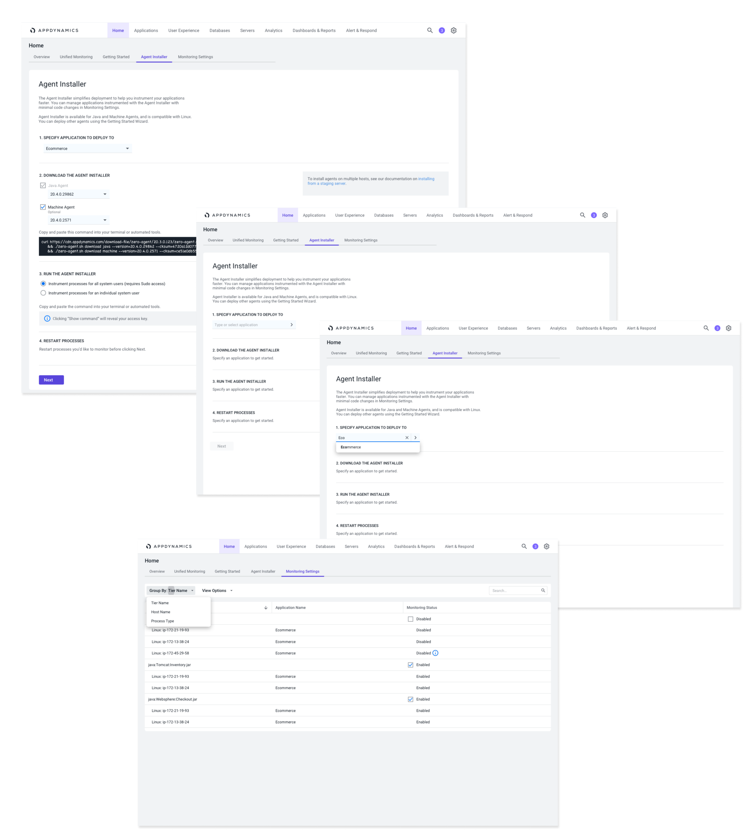
During iterative agile cycles, the team built and launched a limited beta experience. This bundles two agents, includes the first version of automatic tier naming, and instruments all or a subset of processes on the target host.

Based on user feedback we included the filter on the left, and pagination to handle scale on the bottom right.

Some takeaways
We successfully launched a beta of the simplified version of agent install, supporting automatic upgrades with two of our most popular agents—Machine Agent and Java, with .Net, Node.js, Windows, and Linux on the way. With the beta in the hands of select customers, the team will continue to collect feedback, and make incremental improvements as we prepare for a general audience release. Tagging is still something the development is working to support. Two of the target metrics the team will be looking at is a 10% increase in user adoption, and decrease in hours to deployment— which is currently at over 2 hours. Agent install no longer has to be such a painstaking manual process. Whew!

Womply Messenger

Messaging for small business
At Womply we provided small business owners tools to better manage their work. Much of the product work I did included using credit card data to show where else, and how often their customers were spending money, so they can better manage their resources, like scheduling, stocking, online reputation, and advertising.
The kinds of businesses our products focused on were primarily retail, and restaurants – the kind you might look up on Yelp before hand. We had a relationship with the small businesses which gave us a familiarity with their pain points, and one problem we wanted to tackle was communication between employees.
But why you might ask?
What we understood about this population is that there tends to be high turnover. Many of the employees working in restaurants, and retail, work part time. We also knew they had cellphones (who doesn’t). They might also be in school, or even have several jobs. These are people on their feet, often in busy settings while on the job.
So couldn’t they just text?
Well yes, they could, but then the problem you run into is one of privacy. You have to save a bunch of phone numbers of co-workers every time someone new joins the team. You might not need, or want all those contacts on your phone, and what happens when someone quits? Do you delete their number? If you don’t, you could end up with contacts on your phone you may never hear from again. But what if they don’t delete your number, do you want an ex-coworker calling or texting you willy nilly?
Okay, I get it, I don’t want my ex-coworkers and ex-bosses having my phone number. But why not just use Slack?
Slack is great, and definitely something we looked at during our competitive analysis. Slack works really well for big teams, where you need multiple channels, groups, and integrations. Slack is great for offices and desks. However, there’s a lot in there for someone working second shift at the bakery who needs to check their schedule, or wants to check stock in the back room, or someone working register, with a line in need of $20 bills and quarters. You need a quick way to communicate with someone some where else on the floor.
Other apps we looked at during our competitive analysis included WeChat, WhatsApp, Hangouts, KakaoTalk, Line, Skype, Facebook Messenger, Crew, Kik, and a few others. While there are great things about those apps, they tend to skew more social, revolving around friends and family. We were making something more streamlined, more professional, and designed for the workforce. We didn’t need all the stickers.
Enter Womply Messenger
Our primary goals included empowering a high volume workforce by improving team communication on and off shift. We chose to solve this problem with a no-frills chat app which prioritized transparency, fast communication, and teamwork. We wanted to create something that was as simple as texting without having to save any contacts to your phone.
So where did we start?
With the minimum viable product there were several specific areas we wanted to focus on.
On-boarding
Inviting other coworkers
The main chat experience
Take 1
The first time I designed this experience, I added all these on-boarding screens, but during feedback sessions, I heard people would just swipe through them – no one was reading them. Did we even need these screens, what value do they add? So I killed them and revised it all down one screen.
Take 2!

Instead of listing out all the things you can do with the app on 3 different screens, we revised the messaging to read simply: "Join your coworkers and get to work", and changed to tone of the button to "Let's go"; language with a little more energy.
But where's the log in, and password field?
One of the goals of this app was to eliminate the need for passwords. Your phone number is your log in, and we send an SMS code for verification instead of using a password – there's nothing to memorize.
But what if I enter the wrong phone number, or don't get an SMS code?
Well, we try to catch it first with a confirmation screen, but if you miss that, simple: hit back. Once you enter credentials we tie the phone number to a user in the database. We require a valid email address, but you can use the app without immediate verification. We designed a code called a "Magic Code" which is like an invite to make sure you're joining the right business.
Here's the entire on-boarding flow.
On the left is a click through prototype I made using Sketch, and Balsamiq.
On the right is an early version of the app running on android.
Well, now that I'm in, I need to invite others so I have someone to talk to.
The next step in this journey was to design the experience for inviting a coworker into the app.
I started designing the experience with a decision flow diagram to account for the various ways someone can get into the app. It started with the question can I invite someone who isn't already in my contacts list.
Once we identified the main pathways, I started prototyping. I created the screens for the invite, flow and put together something we could click through on a phone.
Alright, I'm in, now let's chat!
In this early prototype of the UI (made with principle), I focused on the read receipts, and how those receipts might be handled if they failed. I partnered with an engineer to make sure I was accounting for as many fail cases that we could think of. I've learned that engineers are pretty good about anticipating how things go wrong – I keep them close.
During design feedback sessions, I was hearing that my initial bubble UI looked heavy, and might be distracting. Do we need the bubbles? Are they adding value visually? Does the UI work without them? I took the feedback, stripped out the clutter, and ended up with an interface that is much easier to read. Yeah, actually it looks beautiful without the bubbles.


So how do I know anyone has seen my message?
Transparency was a priority of the experience, we wanted to ensure people knew they were being heard. In a busy work day messages can get lost; if a message is important enough, we wanted to give people a way to double check that coworkers have seen it. As we brainstormed, and researched ways make this happen, we chose to explore read receipts. I looked at a few other apps to see how they handled read receipts, and created some prototypes to feel out the interaction, and timing. We used single, double, and closed check marks to convey delivered, seen, and seen by all (if in a group) respectively. A tap-and-hold interaction shows who's seen the message, up to 5 people. After 5, we truncated it to "seen by 6 people", we made this choice primarily based on screen real-estate.
What's next?
After we launched the minimum viable product, we started collecting data on how people were using the app. Did it meet our goals? Did it improve transparency, fast communication, and teamwork? One problem we noticed was one of stickiness; were people using the app throughout the day vs. periodic check ins? We found that most people used the app occasionally, and not throughout the day. One hypothesis we had was that, if people were on the move all day, they might not be able to respond to every message, nor should they feel obligated to. But they might want to participate in the conversation without sending a full response.
How might we keep the conversation flowing, without requiring people to type out a response to every message?
To answer this question we developed a feature we called quick actions.
I started designing this feature in low fidelity, then created a lo-fi click through prototype. Once we felt like we were happy with the solution, I moved into high fidelity. I created a few versions to experiment with the interaction, the menu, feedback, and how the quick action icons played into the chat timeline.

In the first iteration, I made a pop out menu. The quick action icons threaded, so they all appeared below the corresponding message. During feedback sessions, it became clear to me that this approach had a flaw: the screen could quickly fill up with a row of threaded responses. I scrapped that idea, and flowed the icons in-line below the message. Tapping the icon would show who sent it. This approach made the conversation flow much more naturally.
Just because people may not have time to fully participate in the conversation, doesn’t mean they don’t want to. We tried to give co-workers tools to facilitate conversation throughout the shift, and tried to include features that allowed everyone to be heard, know their message was received, and participate in the dialogue even if they only had a moment to check in.
What were some of the challenges?
One of the challenges of designing this app came from building it for both iOS, and Android at the same time. We had 1 iOS engineer, and a remote Android engineering team of about 3. We built for both platforms simultaneously, which meant I had to become very familiar with iOS guidelines, and Google Material guidelines. I was delivering design assets for both. I got around this challenge by developing a design system that worked well on both platforms. Occasionally I’d have to make adjustments to accommodate a specific native Android or iOS interaction. By creating a reliable system, I could focus on the user experience, and develop the visual user interface relatively quickly. We held regular design feedback sessions, and I ran everything by the engineers to make sure the hand-off would be as smooth as possible. Sometimes I’d miss details on one platform, and sometimes I’d get an interaction wrong, but with frequent check-ins our engineers would let me know when I made and oversight, and I’d do my best to provide the correct asset in a timely manner. The solution to the problem we set out to solve became the foundation of our team – clear, and transparent communication.

The Learning Choice Academy
The Learning Choice Academy is a San Diego public charter home–school. The goal of this project is to create an experience that promotes an engaging atmosphere, while providing a sense of safety, information about the charter homeschool experience, and also motivates students to succeed. As Design Director, I put together a small team consisting of another designer, and a developer. I led the research, and user experience phase, art directed the design, and designed the homepage.
To learn more about the specific needs, and to set goals for the user experience design we conducted qualitative research. We conducted phone interviews and administered a survey via Survey Monkey placed on the website. We talked to 12 stakeholders throughout The Learning Choice Academy including staff and teachers. We collected 42 survey responses and heard from parents, teachers, and students.
THE CHALLENGE
The Learning Choice Academy has 4 separate resource center locations, with varied curriculum. Our challenge was to present all resource centers as one, while highlighting what makes them unique. The site is used by students to find curriculum, and connect with classmates and teachers. It's also used by parents to find extra curricular events, and build community. The site has a secondary purpose of acting as marketing page to drive enrollment and make free public education accessible to all.
OUR SOLUTION
We re-organized the site architecture to focus on way finding for the curriculum, and programs they offered, and created a section that specifically called out the 4 locations. We defined clear pathways to individual resource centers, and paired that with upcoming events. The secondary purpose of the site is to drive enrollment and to build a sense of community and trust. We put the stories of the families up front, and made sure the enrollment button was clear, visible, and on every page.

THROUGH OUR RESEARCH WE IDENTIFIED 3 MAIN USER TYPES:
The first time information driven parent
The weekly parent looking for student resources
The student looking for upcoming testing dates


I wrote and presented this summary of our research findings. It really helped to get everyone on the same page.
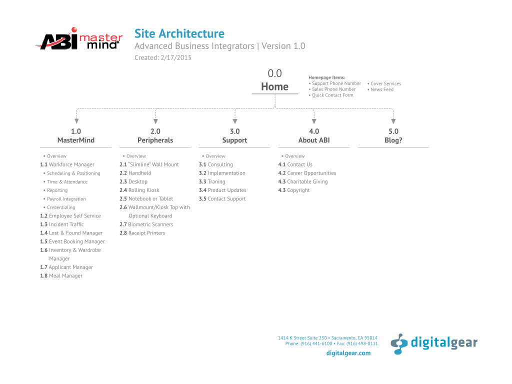
BASED ON THESE USER TYPES, WE DEVELOPED PERSONAS, USER JOURNEYS, AND THE SITE ARCHITECTURE.


VISUAL DESIGN
Once we completed the research, defined the user experience, and felt good about it, we developed a visual language.


As part of the design process, we included a logo redesign.


ABI MASTERMIND

The challenge of this re-design was to better understand how ABI Mastermind fits into people's everyday workflow, how clients found out about ABI Mastermind, if and how frequently they visit the website, and how to take that data to position incentives and features throughout the web experience to reach new potential customers while making the website more valuable to current ABI customers.
We conducted phone interviews and spoke to various users throughout departments including payroll, management, and operations.
We began the design process by leveraging the loyalty of the customers, making the content more shareable, offering ways for users to explore content, and giving the customers a voice.
THE APPROACH
Define clear calls to action for requesting a demos and creating pathways to specific services
Showcase engaging imagery, and create custom icon set
Write for the web in a consistent voice
Feature case studies and prominently
MY ROLE INCLUDED
Lead, and presented research
Art direction
Client services and presentations
Icon design


I wrote and presented this summary of our research findings, this really helped to get everyone on the same page.


My process sketches for the icon set.


Card Transactions
Creating a way for merchants to track incoming revenue
Card Transactions is a popular feature in the Merchant Insights application. It allows people to view individual, incoming credit, and debit card transactions, while providing transparency, and accuracy to the other revenue focused applications. It correlates closely with the Revenue Graphs, since credit card transactions provide one of the data points that populates many of the insights features.
Earlier versions were read only, and had little engagement value, without a method for sorting or finding specific transactions. With a tight 1-week deadline, I put together a small team of 3 – including another UX designer, and Product Manager, and we set out to solve this engagement problem, including improving overall usability.
Objectives:
- Display my transactions.
- Increase engagement by encouraging interaction through sorting, filtering, comments, and starring.
- Provide relevant data about my transactions, and make it easy to find specific transactions
- Narrow down my results so I can find specific transactions

PROCESS
We each did competitive research and focused on looking at specific features, and tasks, and created a SWOT analysis to summarize our findings. We looked specifically at filtering, and displaying interactive tabular data.
After reviewed details/findings from our research, we put the objectives on the wall and narrowed down a list of features to focus on when moving on to sketching.
We worked in design “sprints” and blocked off 5 hours to sketch, and review solutions, limiting ourselves to 30 minute intervals per solution while ideating.
Working independently in the same setting, we set the goal to produce 5 sketch solutions. At the end of the hour, we each ended up with 4 sketches.

For the next block, we put our sketches on the wall for review. We chose the most successful solutions, iterated on them, and narrowed our sketches to 3 options. At this point we checked in with the product manager for feedback.


After a discussion about each option, we chose the one we believed to be the most successful and began wire framing the experience. I took sketches into balsamiq and developed click-through prototypes. We tested the prototypes for usability, collected feedback and refined the wireframes before moving into code.
We learned from testing that our first attempt at filtering wasn't intuitive, so as we iterated, we refined the filtering options, and filtering UI. Another concept we introduced was tagging, which turned out to be confusing, and unclear, especially beside comments, so we dropped it as we moved forward.

To reduce engineering complexity for the minimum viable product, the Product Manager chose to drop starring, and comments. This decision allowed us to ship the feature quickly, and gain analytics from a wider user base.


I worked closely with the engineers to come up with a mobile solution. Data tables for mobile can be particularly challenging, since they don't shrink down quite as nice as block column layout. The first approach I considered was a table with a max-width, and an inner scroll; the user would scroll left to right to see all the fields in table. None of us were very happy with this solution. One of the engineers had the idea of displaying the table as a list, and labeling each field vertically. This solution allowed all the data to be presented, and naturally scrollable. I put together some quick wireframes to get a feel for layout, and we moved forward into code.


The Master Plan
The Master Plan is a workbook for middle school aged siblings of children diagnosed with pediatric cancer. It's targeted at reducing stress, and increasing the sibling relationship. It utilizes cognitive behavioral therapy, coping skills, and psychoeducation around cancer and how it can impact each family member.
As a personal side project I partnered with a therapist who performed research, and content writing, while I was responsible for the page layout, composition, and design.


Insights Revenue Graphs
The Merchant Insights' revenue graphs are one of the most popular features of the application. The revenue graphs allow merchants to see incoming revenue trends; though due to the complexity of previous version, engagement was low. The previous version of the revenue graph had 36 views that the merchant could select from. The problem was that the selection controls were complex and could be difficult to understand.
Based on analytics, and merchant feedback we knew the highest engagement was related to Revenue, Revenue Comparison, and Day of Week. With this in mind, I collaborated with product management, and the engineering team to redesign the graph experience from the ground up. We simplified the design, separated the graphs into 3 focused experiences, and surfaced the date range selection control allowing for custom date selection which was previously unavailable.
PROCESS:
Along with the Product Manager and company founder, we collectively defined goals and objectives, and I began with low fidelity pencil sketches. When we were comfortable we were heading in the right direction, I created a limited number of hi-fidelity variations to collect feedback. Using the UI animation tool Principle, I developed prototypes to test usability, illustrate intent, and gain feedback on engineering complexity. The PM and I worked closely with the engineering team to incorporate feedback and come up with a successful approach to develop the graphs into a live interactive feature.

TEMPLATES :
Since we had several graphs that relied on the same visual language, I developed a series of templates to illustrate how the data connects to the visual language. As an additional guide, I included annotations to indicate spacing, intention, and typography.

Choose your own CA

Choose your own CA is a trading card game designed as part of a California travel marketing campaign for the CalTravel conference in 2015. Designed to be a community generated trading card game, each deck has a set of destinations, with corresponding activities & attractions for each destination. We set out to create the top 100 California locations and activities as nominated by travelers, and attendees of the conference. As Design Director at Digital Gear, I developed the initial 12 card deck, and led art direction for the illustration, design, and copy writing.


THE ANITA BORG INSTITUTE
The Anita Borg Institute helps women by providing technology resources, and community. While at Mule Design, I was responsible for visual redesign, including Wordpress development and client services.
Visit the live site Anitaborg.org

2015 Art Institue speaker series


As part of the 2015 Art Institute Speaker Series, I was invited to give a talk on Human Centered Design. Human Centered Design is philosophy, process, and approach that I'm very passionate about. While Design Director at Digital Gear, I incorporated HCD practices into each project we took on, and it's a fundamental part of my process today. At the Art Institute, the curriculum tends to lean technical, so when I was invited to speak I wanted to give a talk that was rooted in design thinking ,and centered around people, with some non-technical, and hopefully inspirational takeaways.

Greenstack
Greenstack is a mobile iPhone app that provides a simple way to save people money, by taking advantage of membership perks, combining coupons, and providing savings in places they spend the most. As part of a small team including engineers, and the product manager, I lead design including UX, branding, and mobile UI. My responsibilities included brand development, marketing design, and defining the user experience, and user testing.
